Intro to Dashboards
Dashboards provide a flexible way to view and analyze multiple types of reporting data in one place. This can include ad platform insights, attribution insights, product performance, customer event data, CRM insights, custom conversion goals, journey analytics, and sales data. Dashboards in Stiddle are composed of report widgets. Each widget is fully customizable and can be configured within Stiddle’s report builder, then saved as a live widget on the dashboard.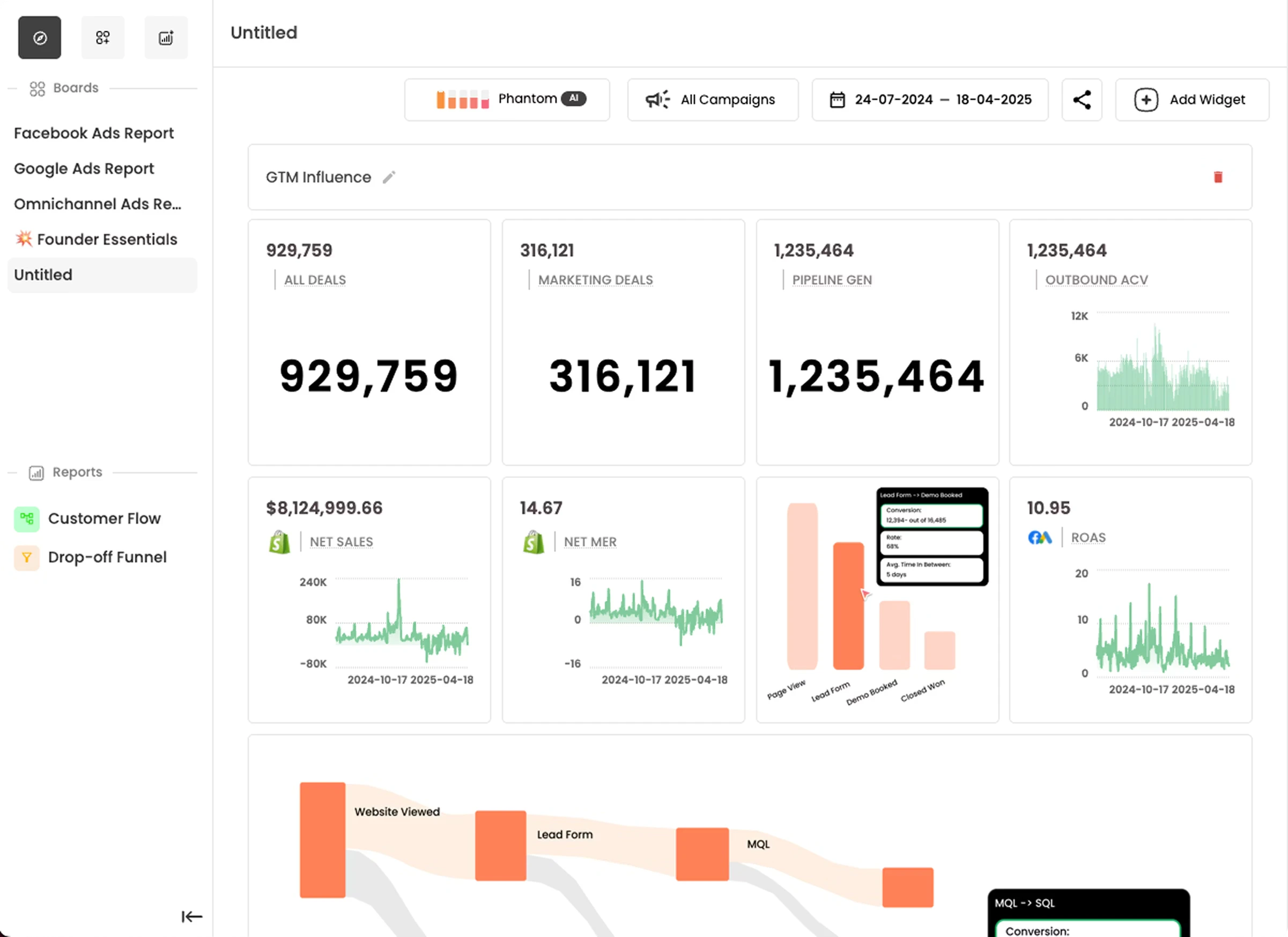
Managing Dashboards
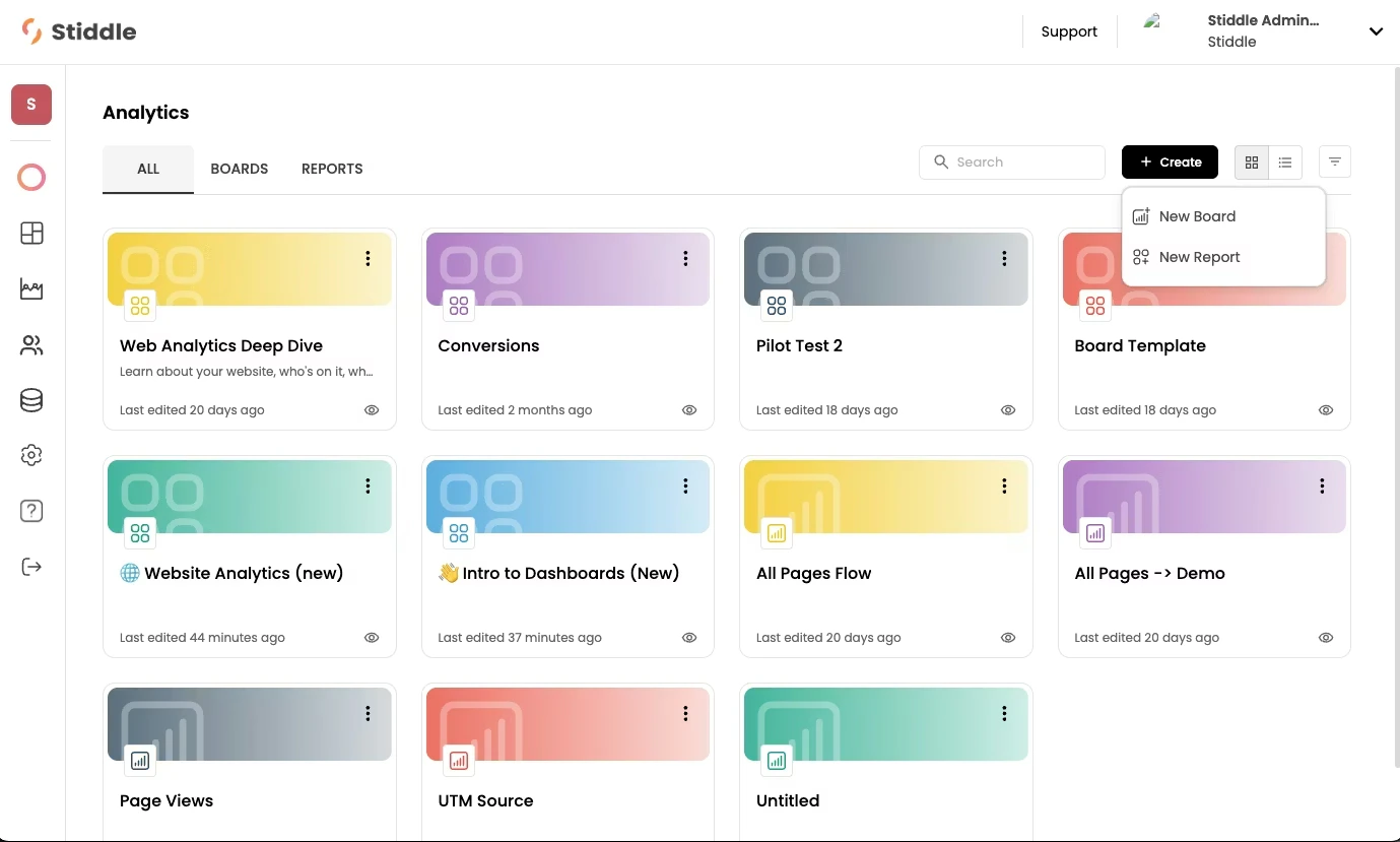
To access dashboards, navigate to the Analytics tab in the left sidebar of the Stiddle navigation menu. This opens the All Analytics page, which displays all reports and dashboards created within Stiddle by default. Select the Boards tab to view only dashboards and filter out reports.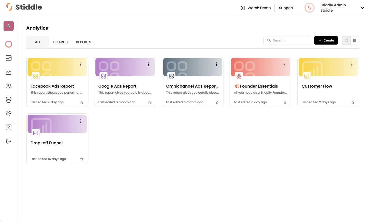
It’s valuable to understand the relationship between reports and dashboards, since dashboard widgets are built from reports. Each dashboard widget has a corresponding report created automatically with it. If you delete a report that’s currently active as a widget on a dashboard, that widget will no longer display.

Creating New Dashboards
To create a new dashboard, select the “Create” button on the “All Analytics” page. You’ll be prompted to choose between creating a report or a dashboard. Then you can build your dashboard using an existing template or start from a blank canvas.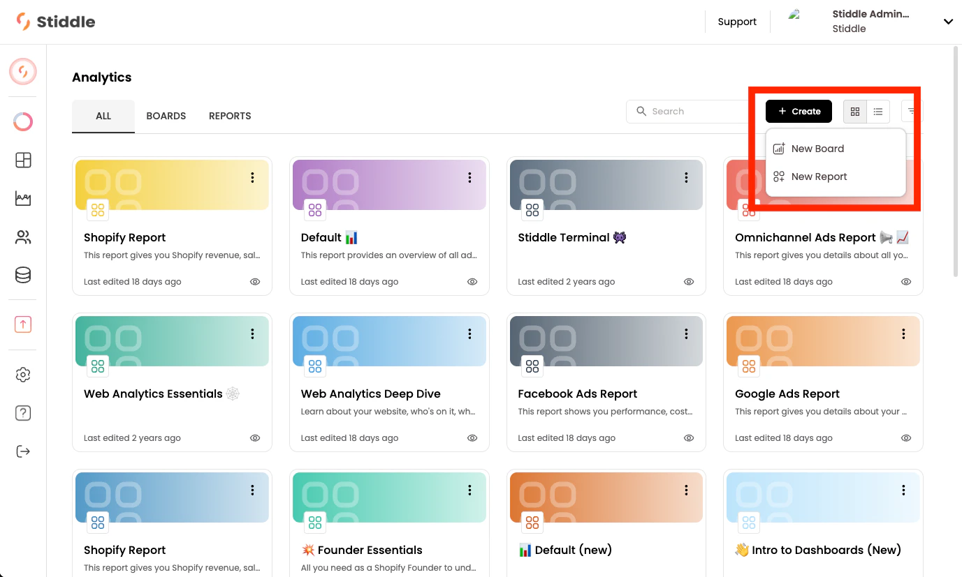
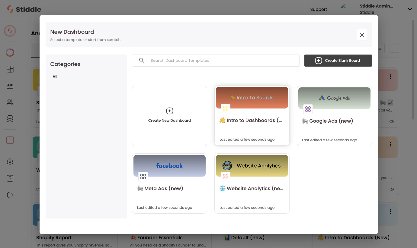
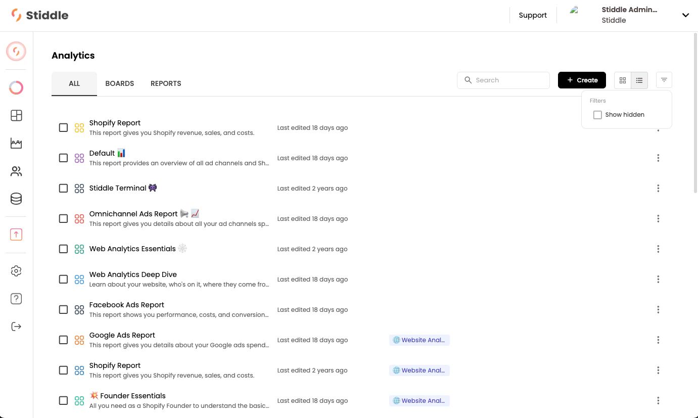
When you create a new dashboard from a template, the system automatically generates reports for each widget. For example, a dashboard with 20 widgets will generate 20 reports. By default, these reports are marked as “Hidden” and can be viewed on the “All Analytics” page by applying the “Show Hidden” filter.
Adding Widgets to Dashboards
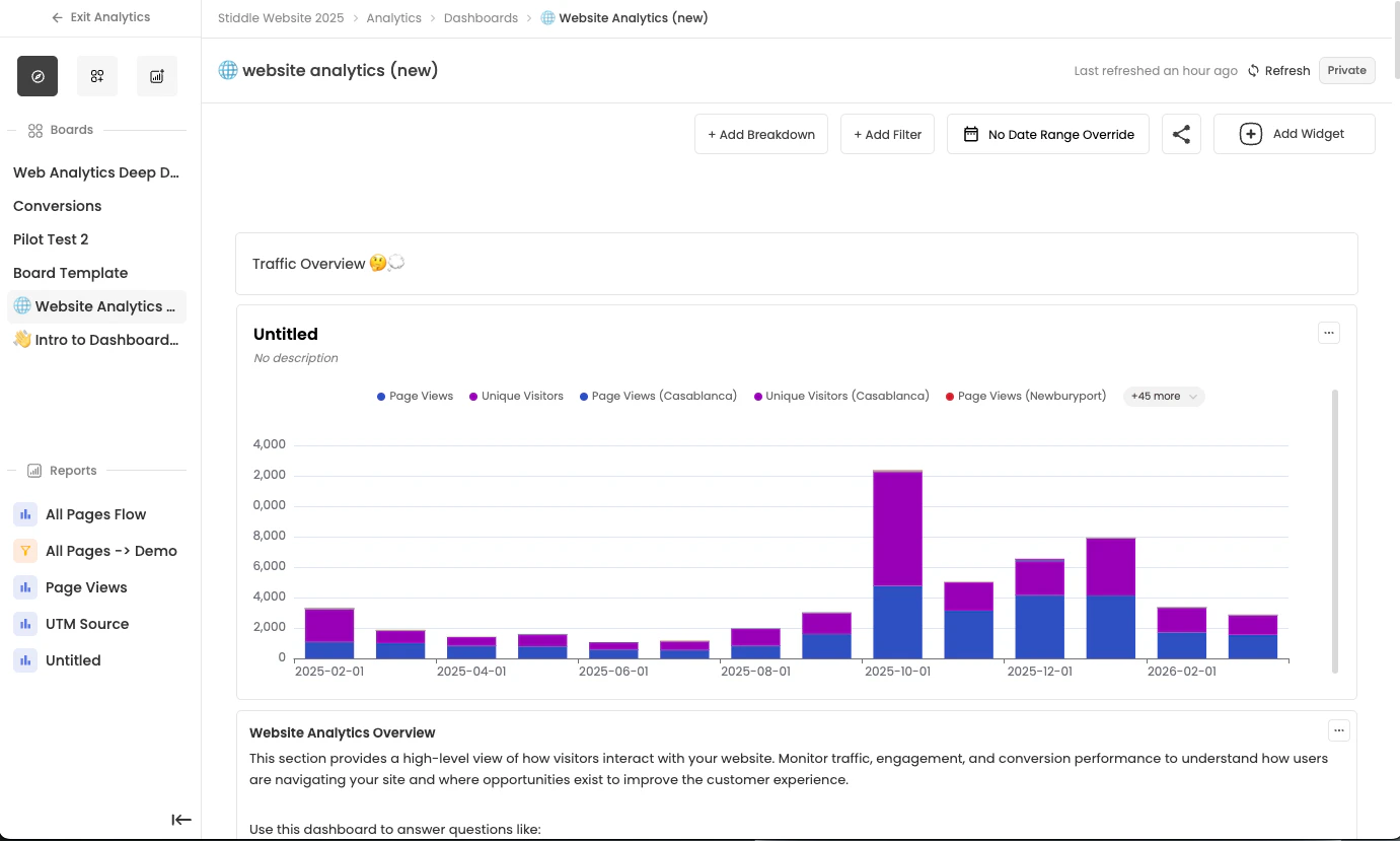
In this example, the “Website Analytics” dashboard template is selected, and the dashboard editor opens.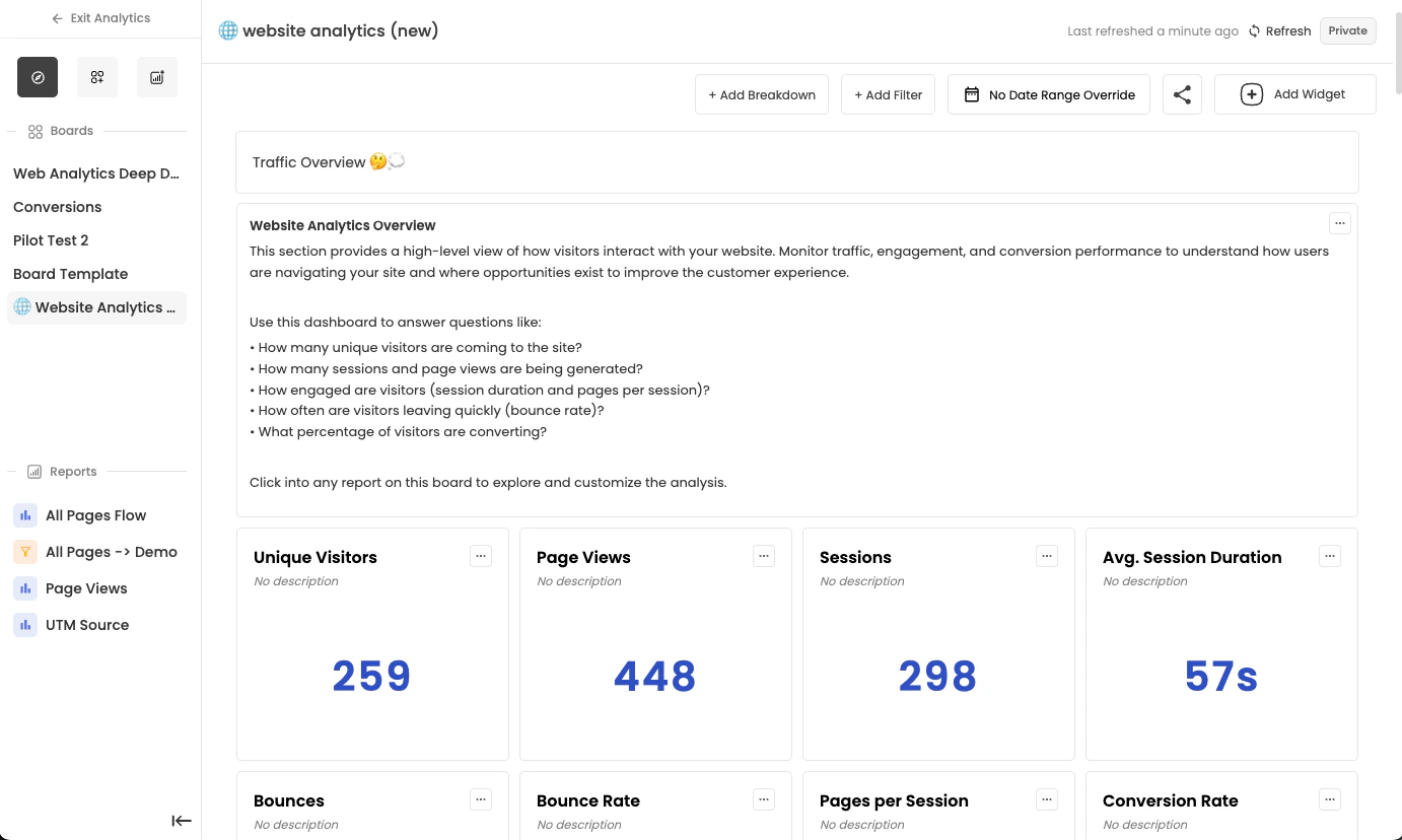
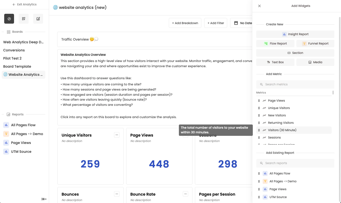
- Add a metric: Drag and drop a new metric from the “Metrics” section. This is the quickest way to create a simple widget.
- Create a custom report: Select “Insight Report” from the “Create New” section at the top for a more complex, customized report.
- Reuse an existing report: Drag and drop an existing report from the right menu.
- Add text or media: Select a text box or video/image widget.
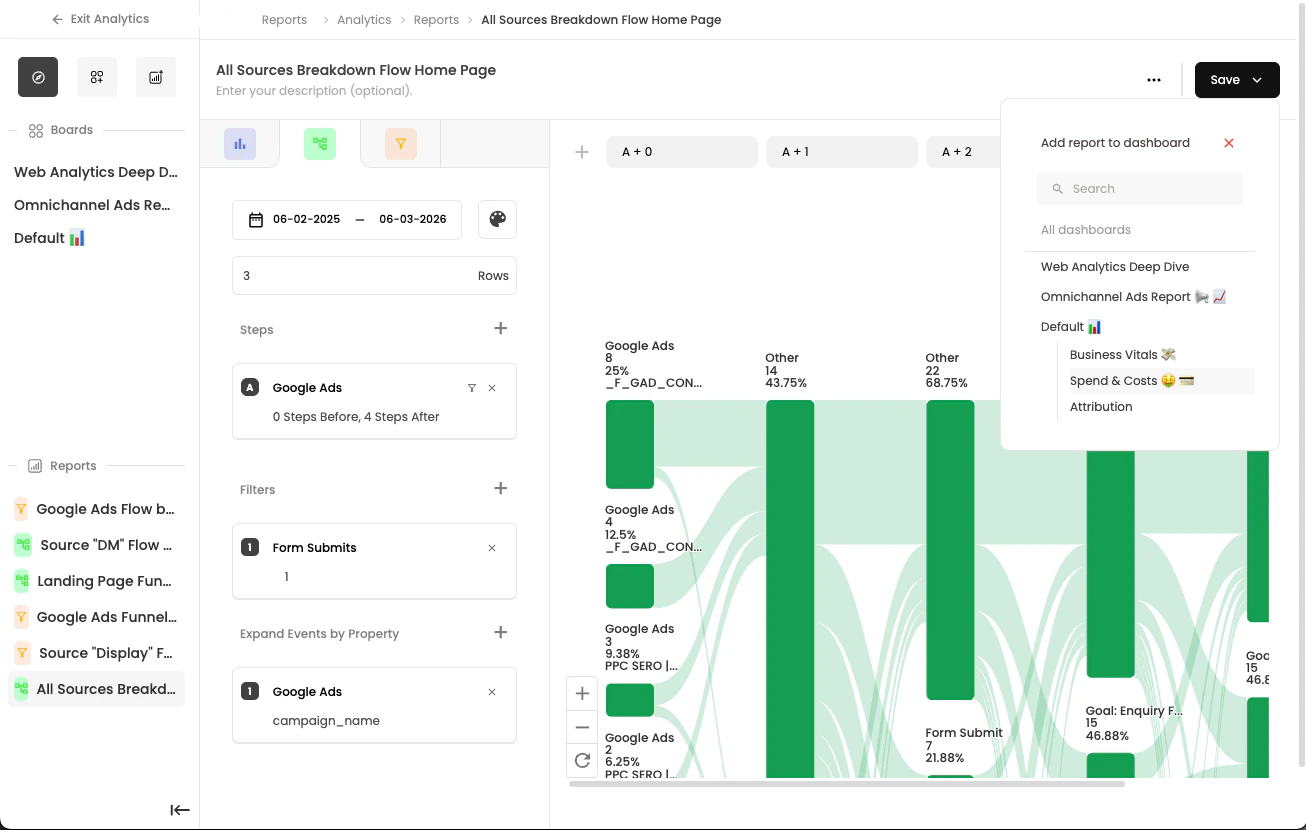
Saving a Report To a Dashboard
Another way to save a widget to a dashboard is by saving it directly within the report builder. For example, when you build a report and select “Save,” you can choose the dashboard and section where you want to add the widget directly from the report builder. This approach ensures that when the report is edited in the future, any updates automatically reflect in the dashboard widget.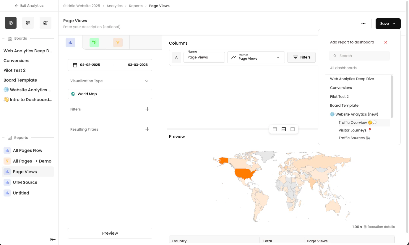
Widgets can only be added to sections. You must first drag and drop a section onto the main dashboard canvas before adding widgets. Additionally, widgets cannot be moved between sections.
Configuring Widgets
There are several configurations available for widgets on the dashboard page. When you select the 3-dots menu on a widget, a dropdown of configuration options appears.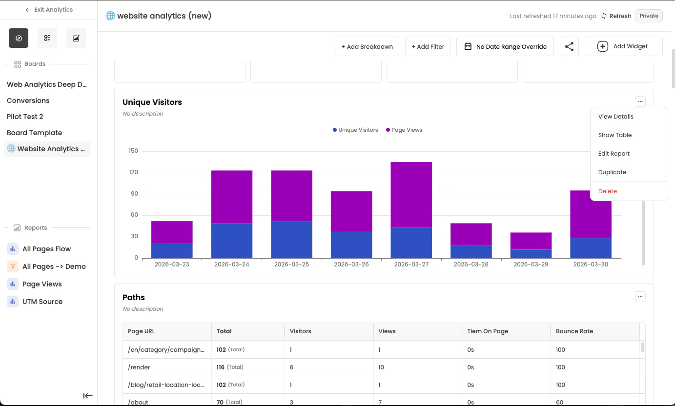
View Details
The View Details option lets you quickly see what configurations have been applied and saved to a report widget without opening the full report. For example, you can view the attribution model, date range, filters, breakdowns, and more at a glance.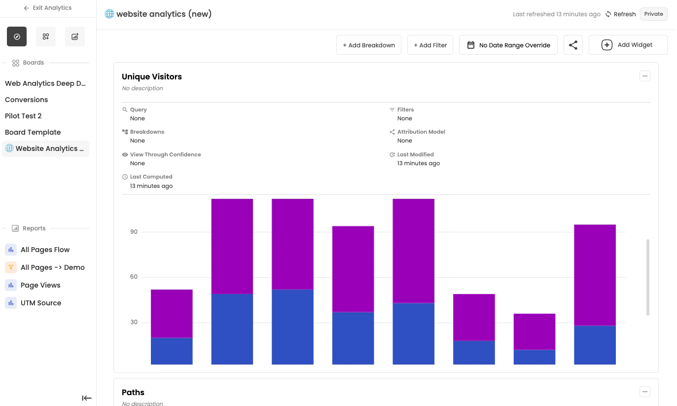
Each widget has its own configurations, including date range, filters, breakdowns, definitions, and visualization types. Keep this in mind when viewing the dashboard.
Show Table
You can display a table view without opening the full report or changing the visualization type. This is useful for quickly reviewing totals or averages in a table format. To view a table, select the “Show Table” button. You can hide it anytime.
Duplicate
When you duplicate a widget on the dashboard, a new report is created. This allows you to configure the duplicate report independently in the report builder. For example, this is useful when you want to display the same metric with different date ranges or attribution models on the same dashboard.Editing Widget Report
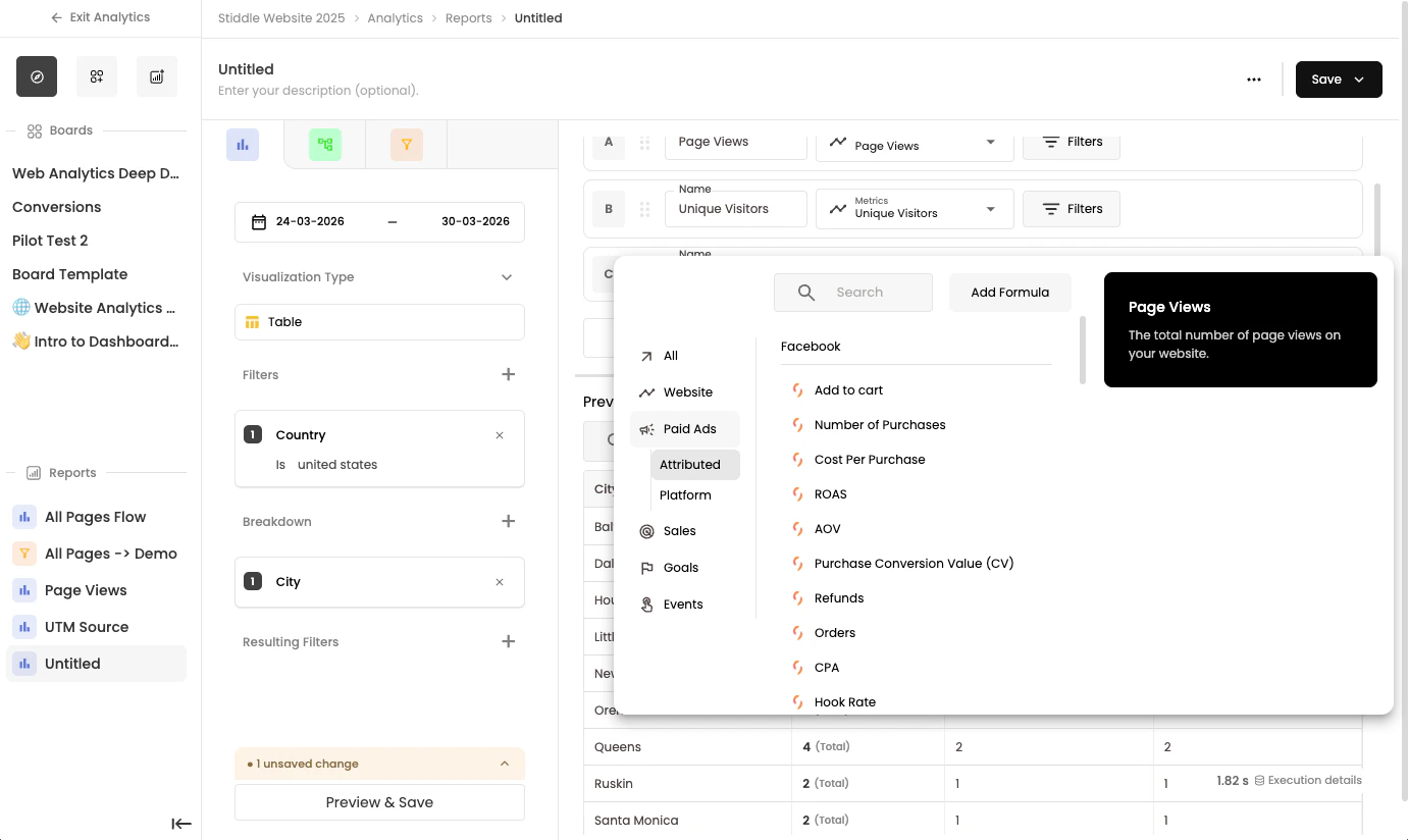
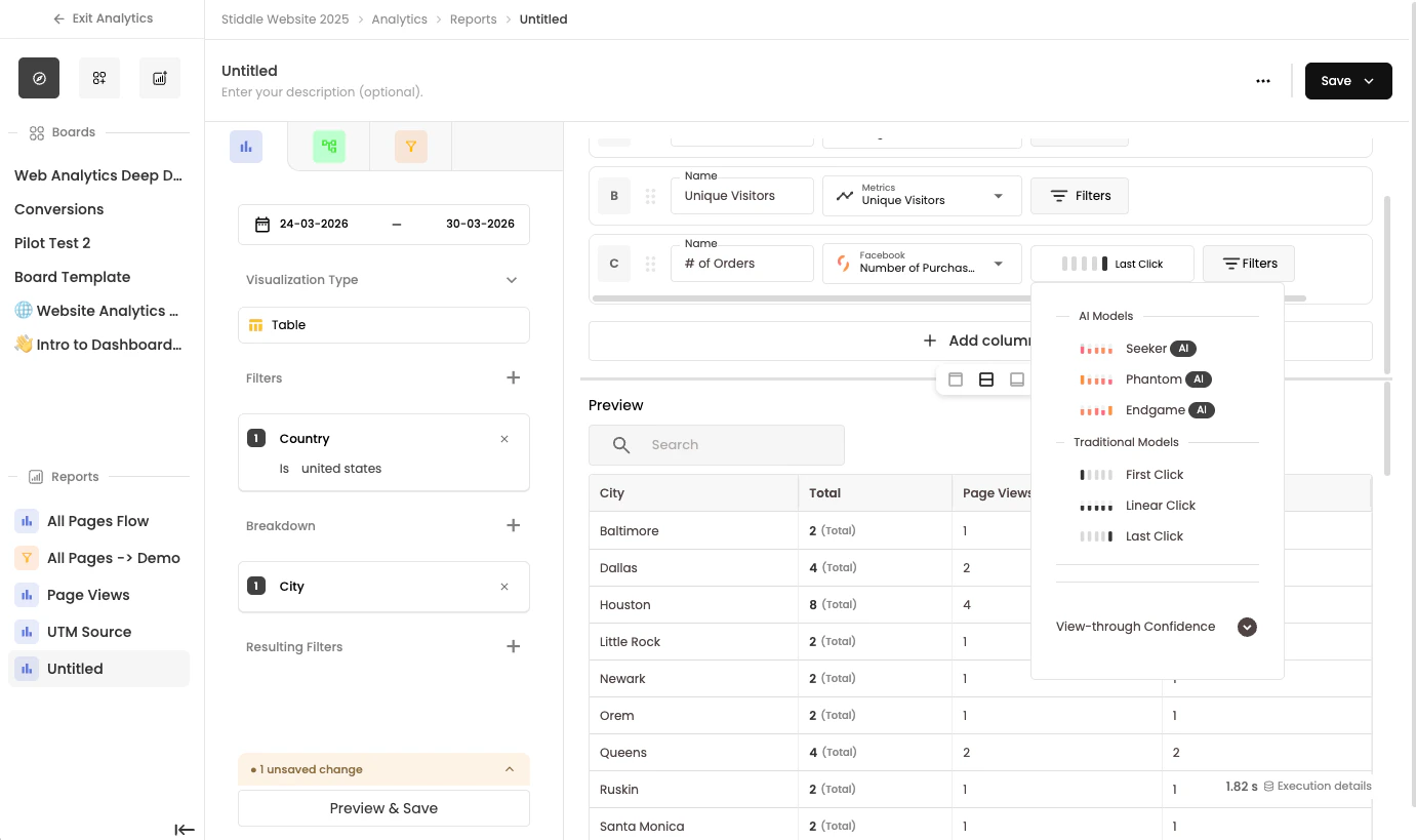
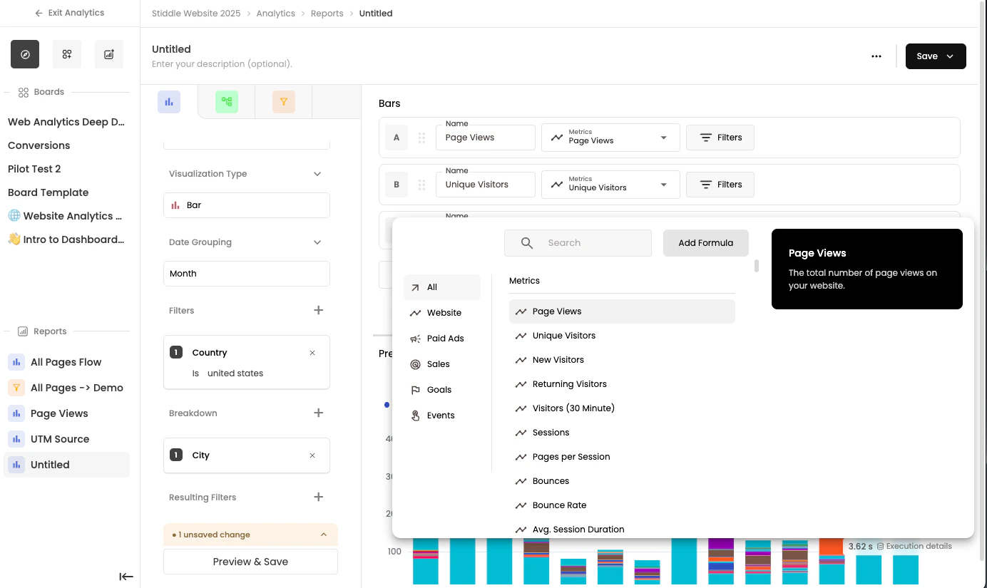
To edit a widget report, select the Edit Report button in the dropdown menu, or click the top bar of the widget (near the widget name). Either action opens the report builder for that widget. Editing a widget report lets you customize that specific widget. You can add metric definitions, apply filters, create breakdowns, change attribution models, adjust visualization types, and more. See the Report Builder section below for detailed guidance.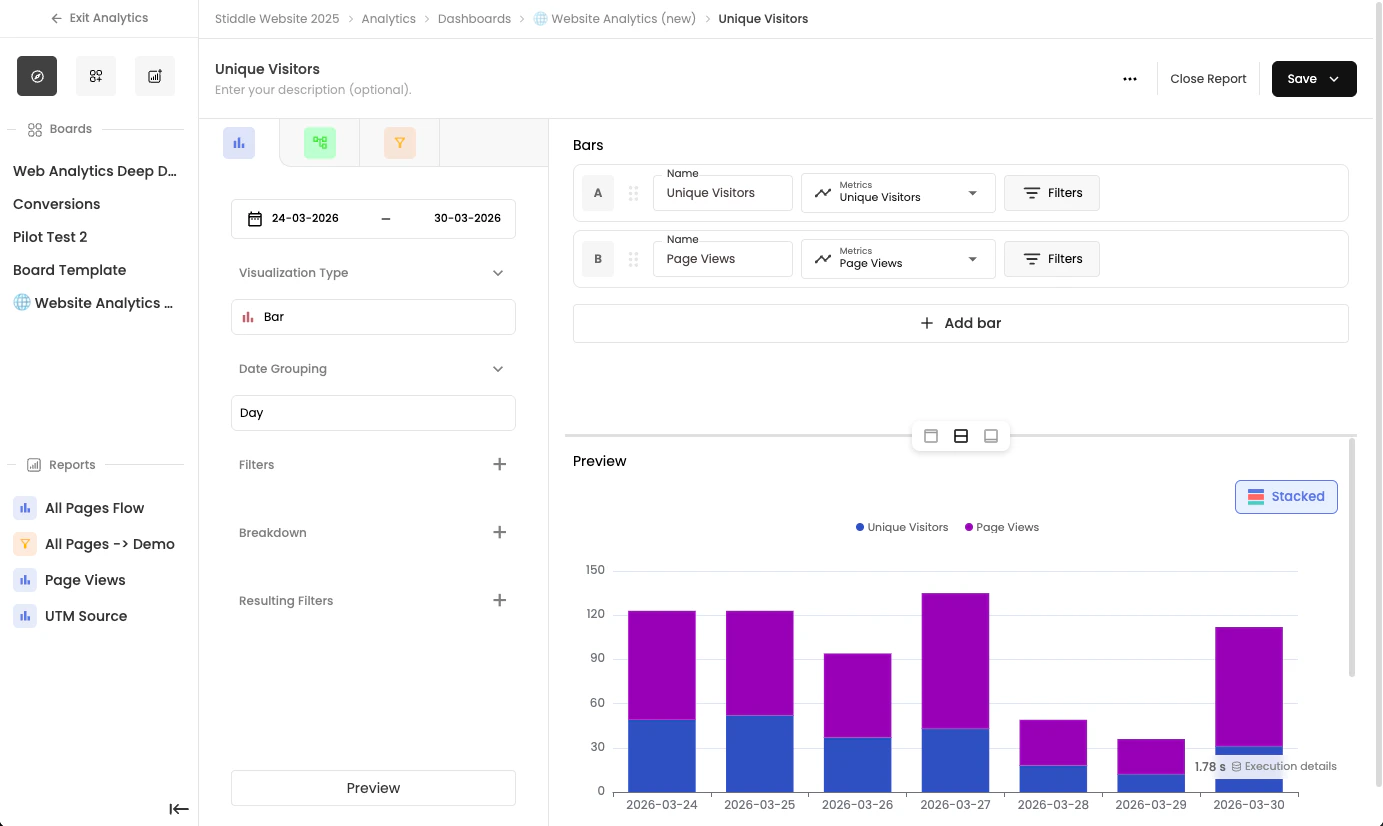
Rename Widget
To rename a widget and its description, hover over the widget name, select the edit icon, and then select save.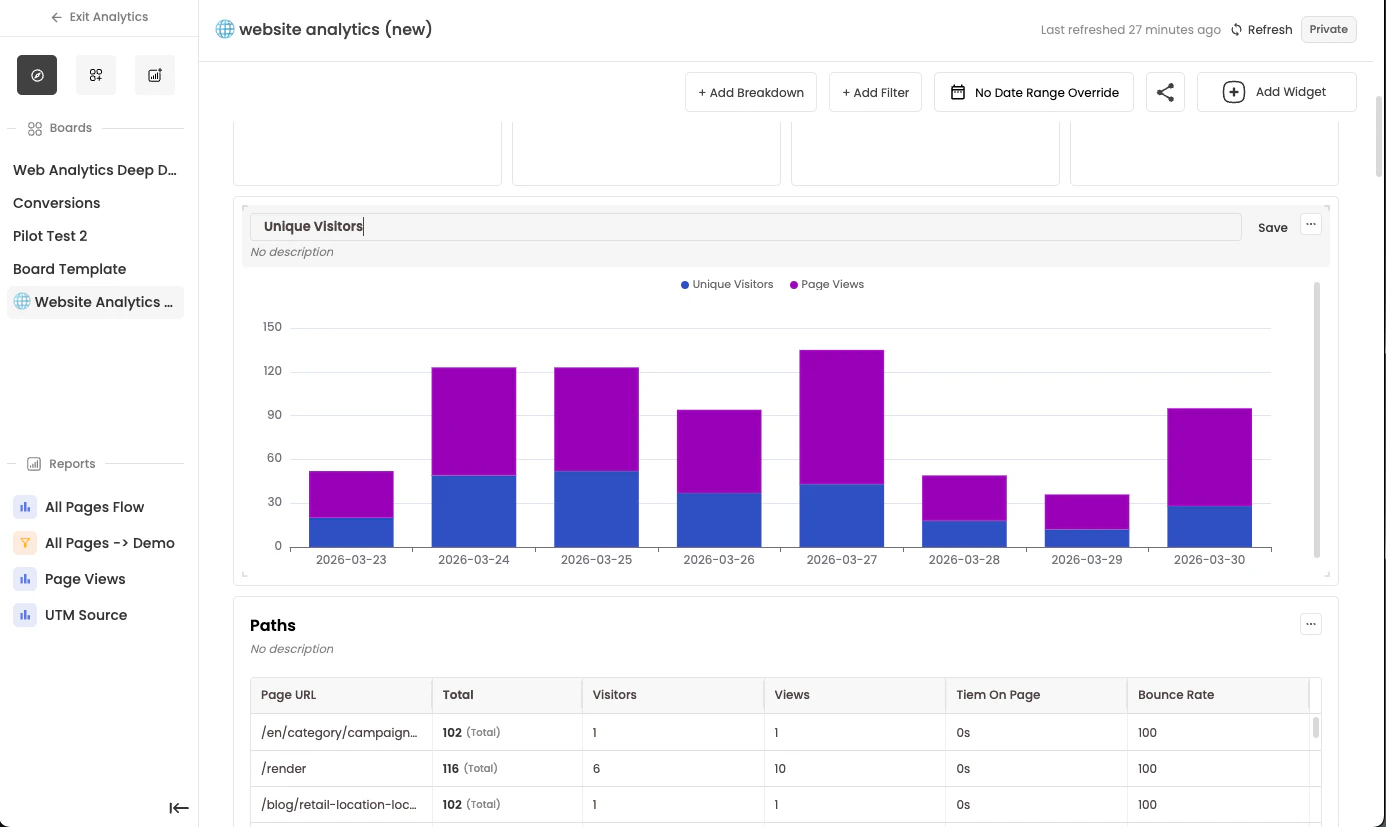
Configuring Dashboards
Since dashboards are composed of report widgets, each widget is configured separately within the report builder. This includes the date range, filters, breakdowns, and attribution models. With dashboard configurations, Stiddle lets you apply an override to report widget configurations. This is useful when you want to view all dashboard widgets for a specific time period—for example, “All dashboard widgets in the last 30 days”—without editing each widget individually.Understanding Date Override
By applying a date override to the dashboard, Stiddle changes the default date of each report widget. For example, if your report widgets use different date ranges—some showing the last 7 days and others the last 30 days—you can select a date override of “last 7 days” to ensure all widgets display the same date range. To remove the override and restore each widget to its original date range, select “No date override” in the date selector.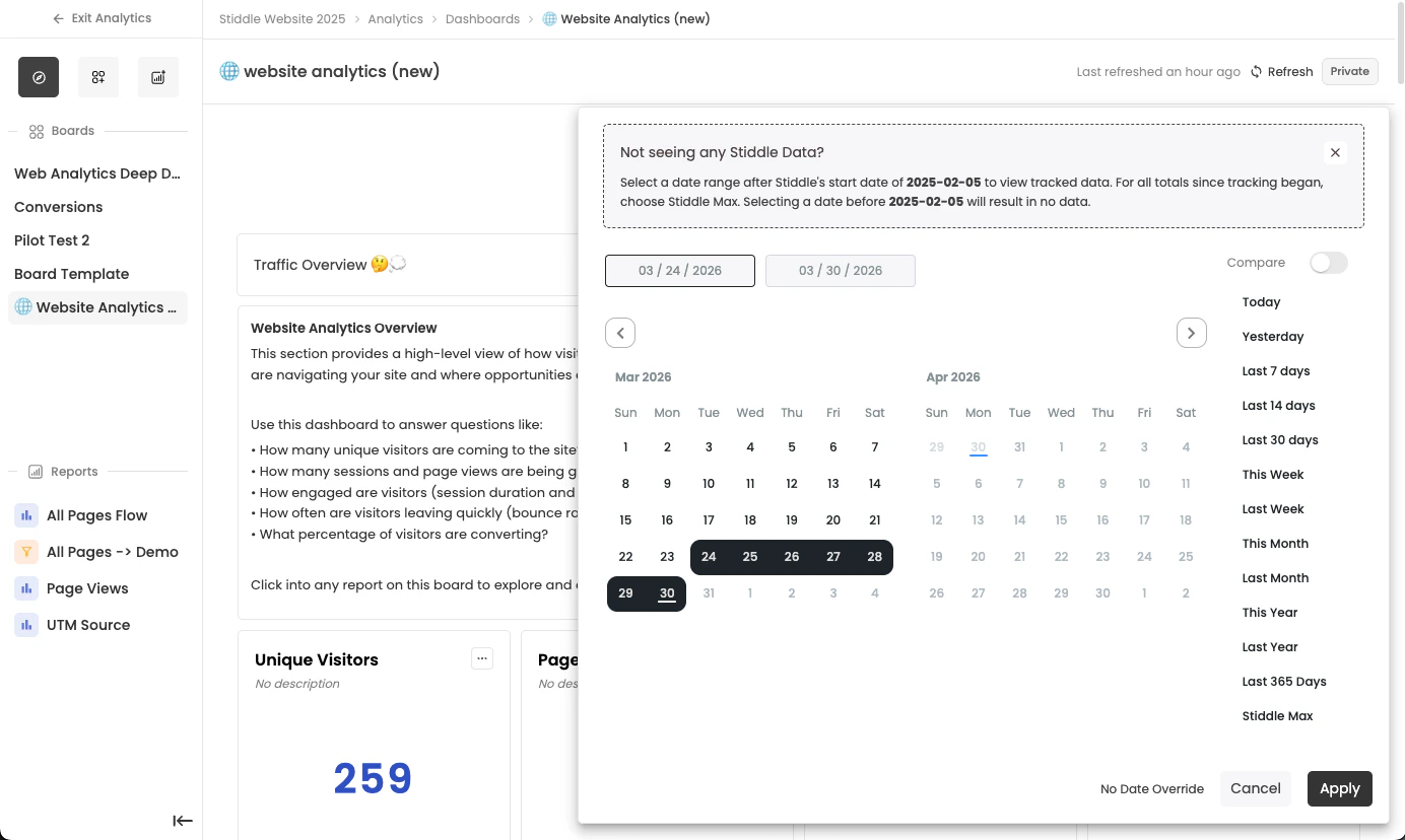
Understanding Filter Override
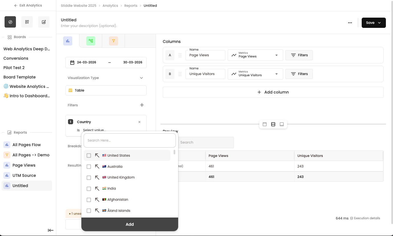
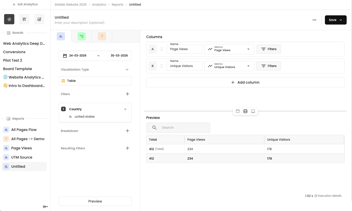
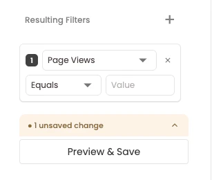
By applying a filter override, you can add additional filters to all report widgets on the dashboard. This is useful for analyzing a specific cohort without editing each widget individually. For example, you might want to filter by location “United States”. To do so, apply a new dashboard filter and select “Country” = “United States”. All dashboard data is now filtered to show only United States results.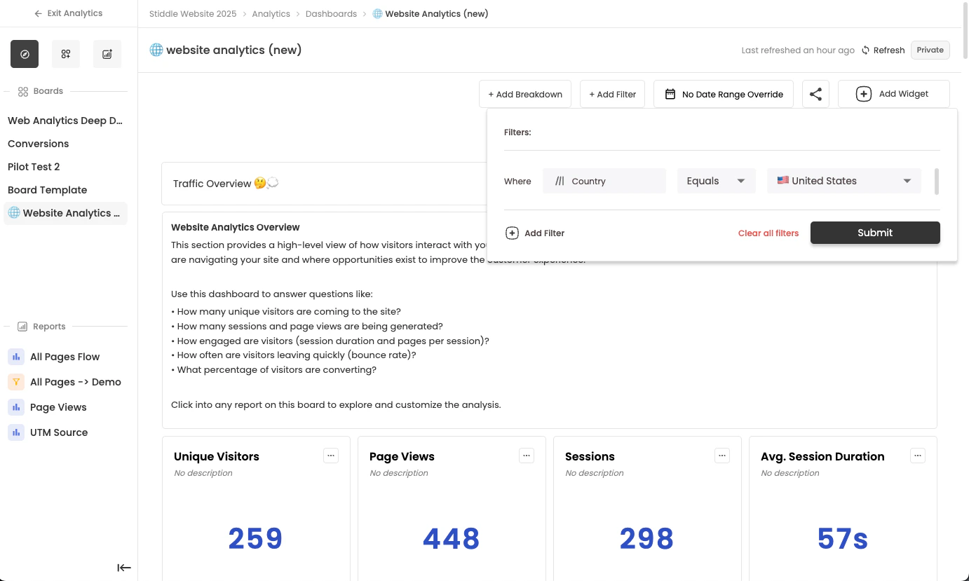
Understanding Breakdown Override
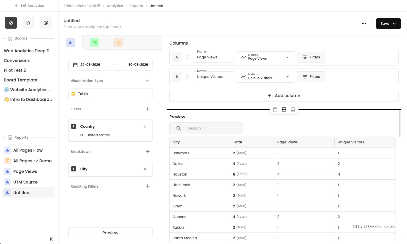
By applying a breakdown override, you can break down all report widgets by the same dimension without opening each report’s configuration. This override replaces any existing breakdown default on the widget. To apply a breakdown override, select Add Breakdown and choose a breakdown option. The override then applies to all report widgets on the dashboard. To remove it, select the X in the pill next to the Add Breakdown button.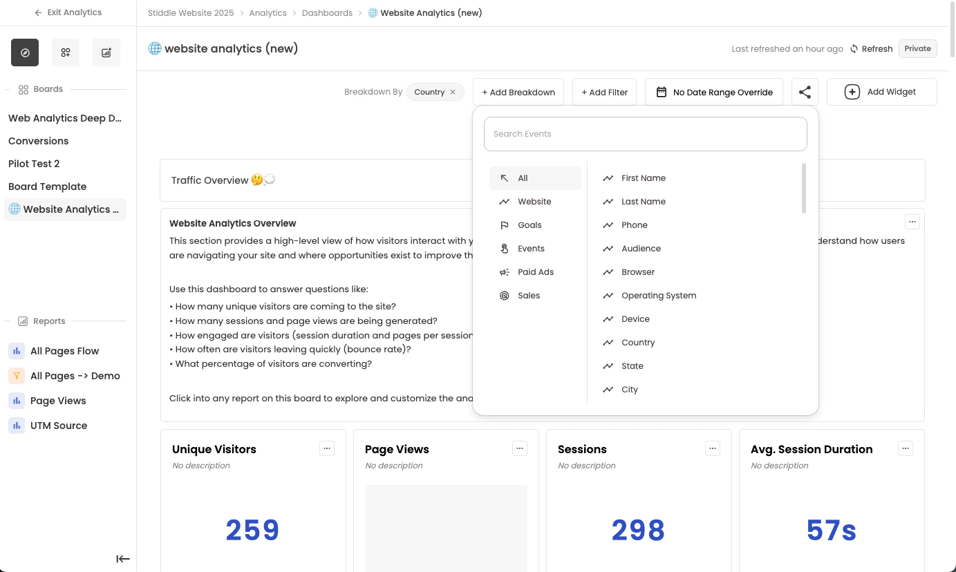
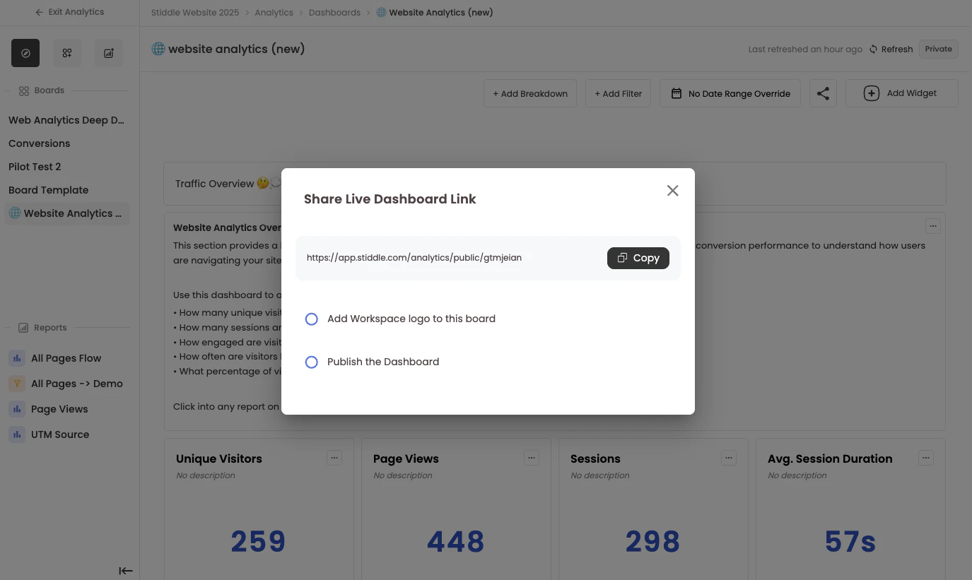
Sharing Dashboards
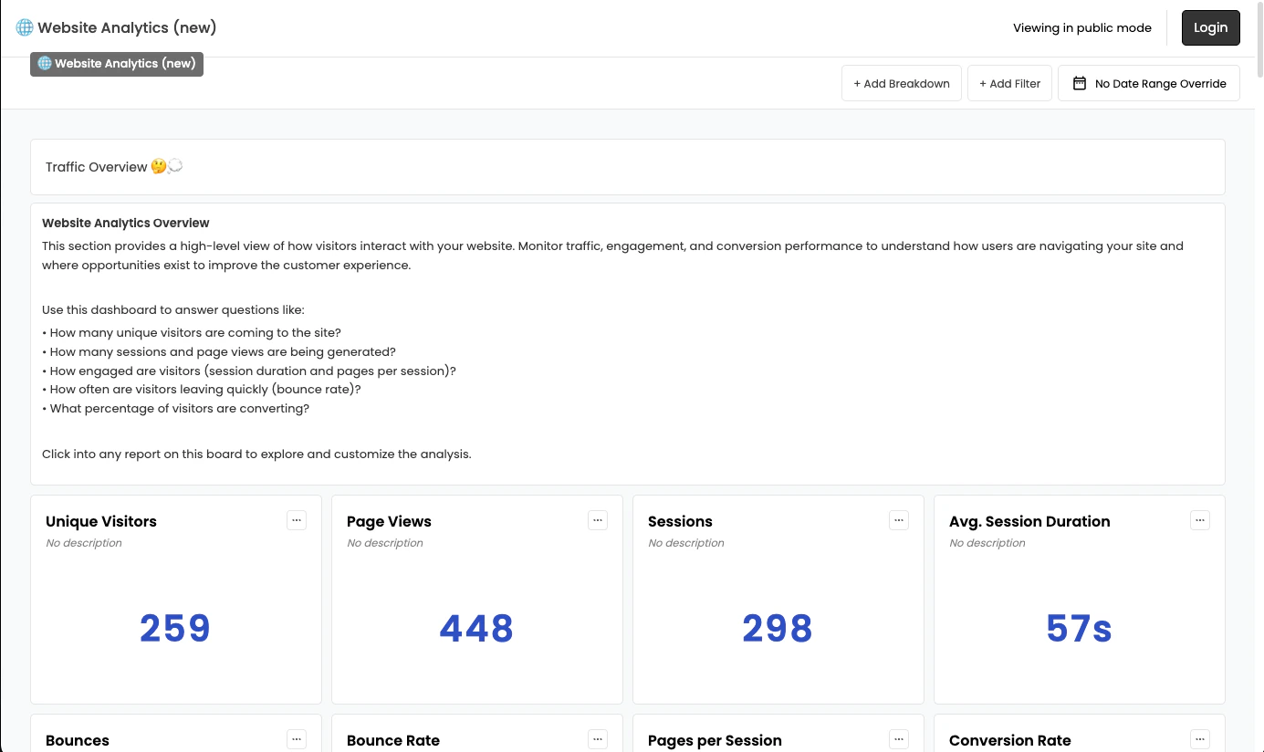
Sharing dashboards is straightforward and offers two options: download the dashboard as a PDF or print it, or publish it and share the live hosted link. To access either option, select the share icon in the top right corner. A dropdown menu will appear with your sharing options.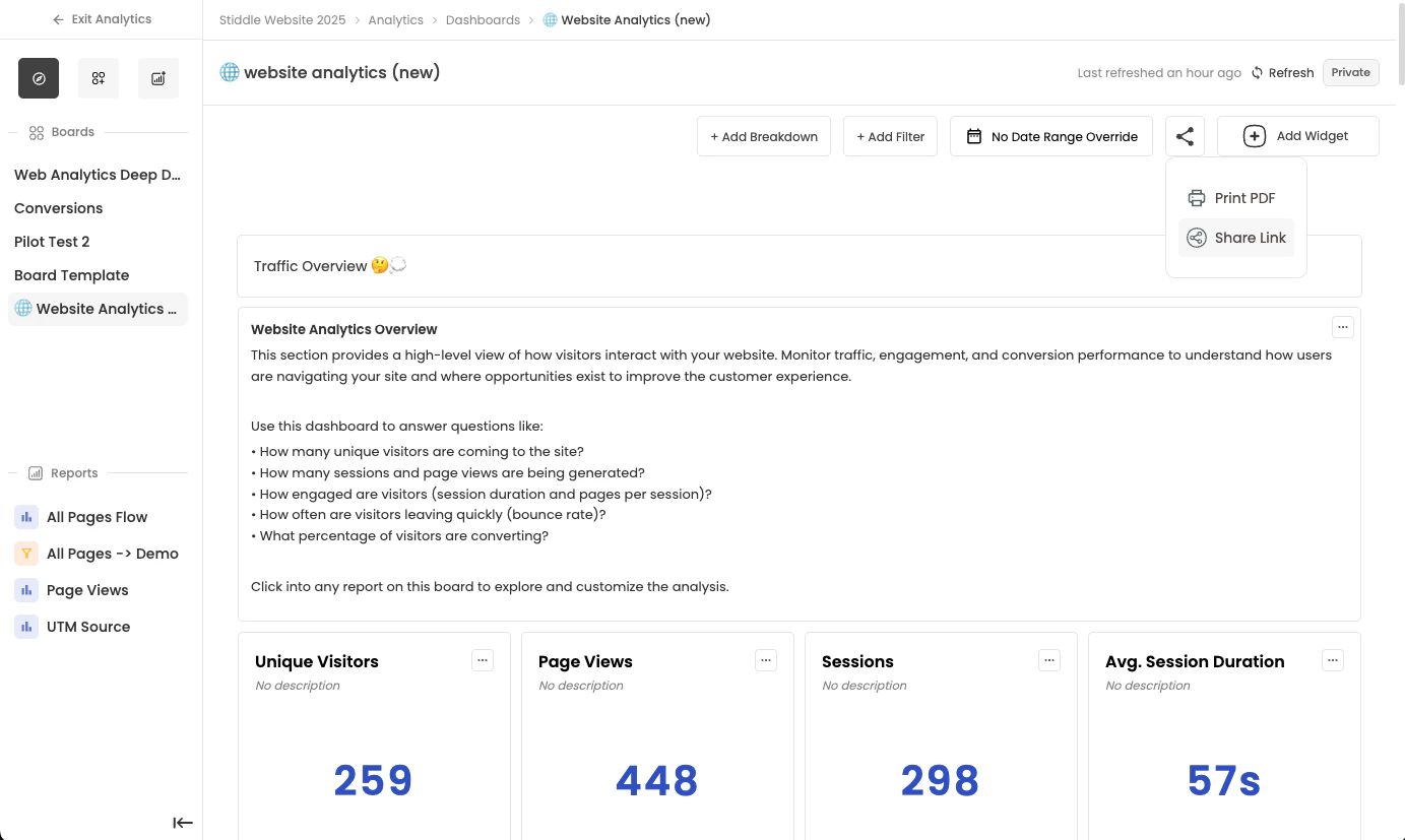
- Add your company logo — When you select this option, the logo from your workspace settings is added to the public dashboard.
- Mark as published — To share the live dashboard, you must mark it as published. If you share the link without publishing it, the public board won’t be accessible.
Intro to Reports
Stiddle supports several report types, each of which can be configured and saved as a widget on any dashboard. You can also build reports independently without adding them to a dashboard. Reports let you dive deeper into your data to explore new insights and create custom dashboards and BI analyses. There are three types of reports within Stiddle.- Insights – Analyze trends, performance, and key metrics over time
- Funnels – Understand how customers progress through important steps or conversions
- Flows – Visualize how users move through your product, website, or funnel
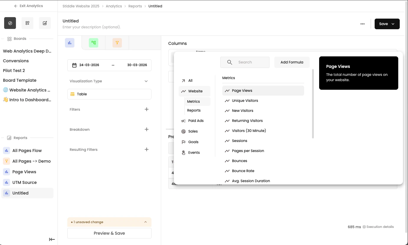
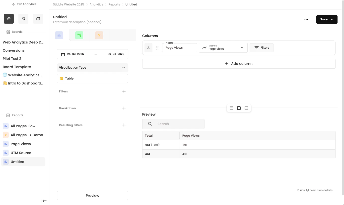
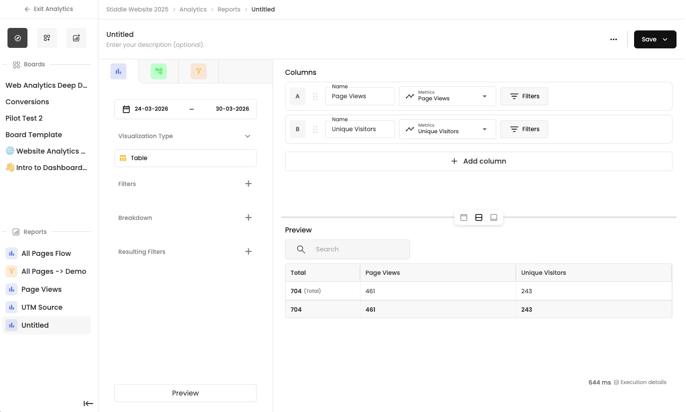
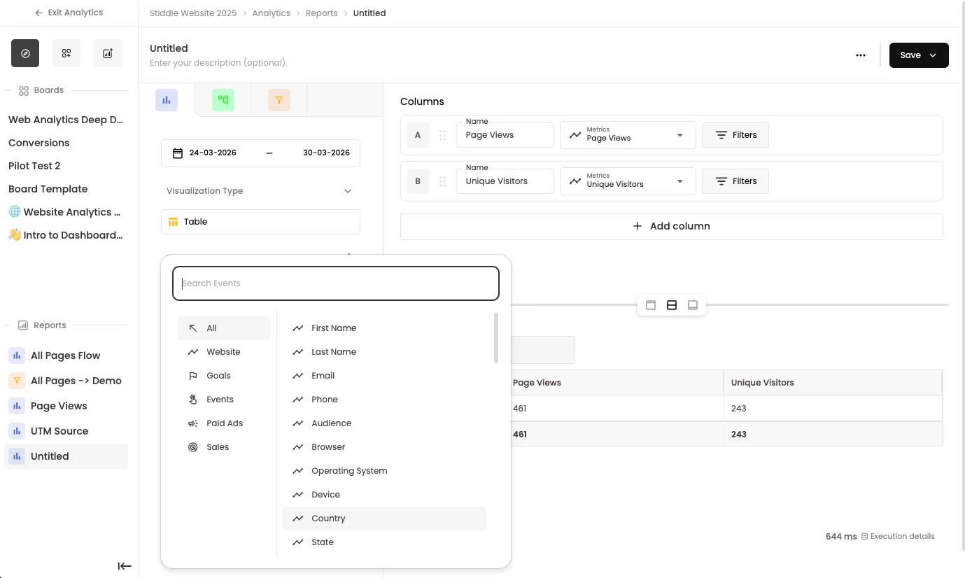
Insight Reports
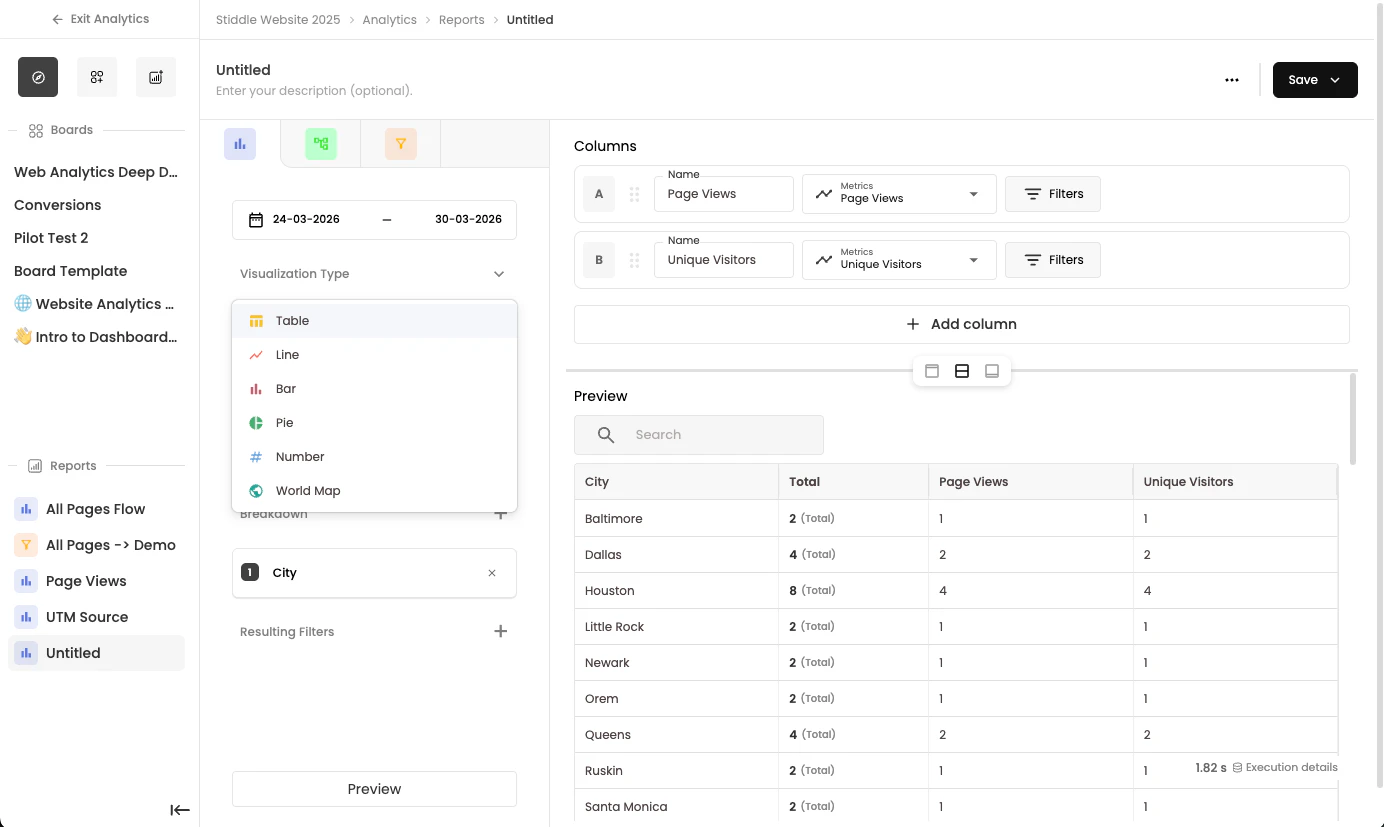
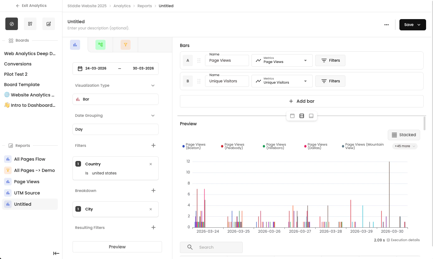
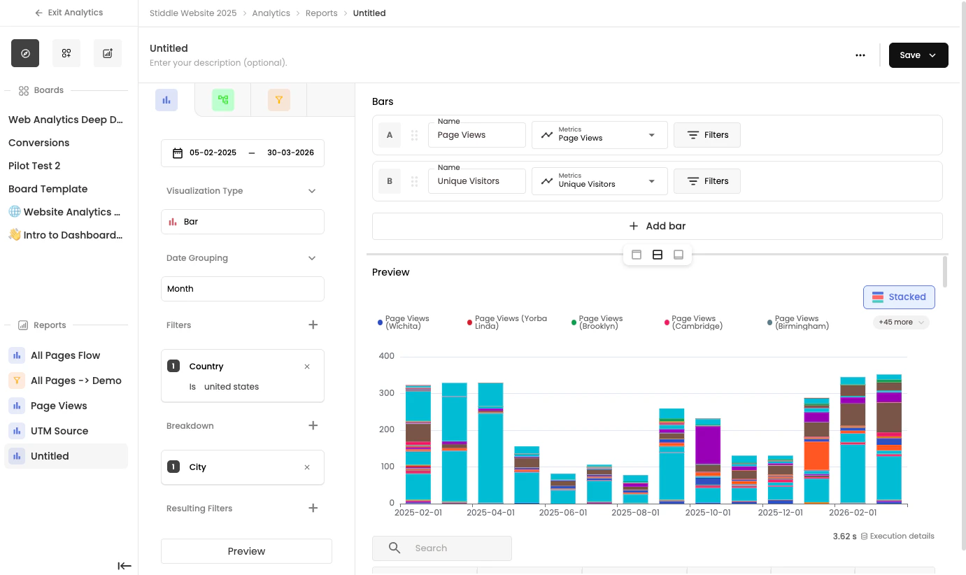
Insight reports let you build custom reports using Stiddle data, attribution insights, sales data, CRM data, ads data, and more. Insights helps you analyze trends and explore the metrics that matter most to your business. You can visualize events, customer activity, and revenue data using flexible charts and filters. Use Insights to answer questions like: • How many customers converted yesterday?• Which channels are driving the most revenue?
• How are key metrics trending over time?
• How are specific customer segments performing?
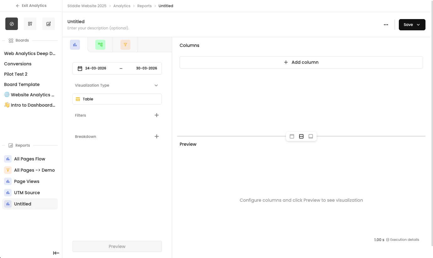
Creating a New Insight Report
To create a new report, select New Report from the Create dropdown on the Analytics page, then select Create Blank Report in the popup.
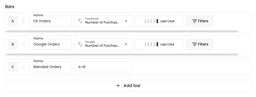
A+B / 100.
Saving Reports to Dashboards
Once you’ve finished building this report, you can easily save it to an existing dashboard. To save the report, select the Save button dropdown in the top right corner, then choose the dashboard and section where you want to add the widget.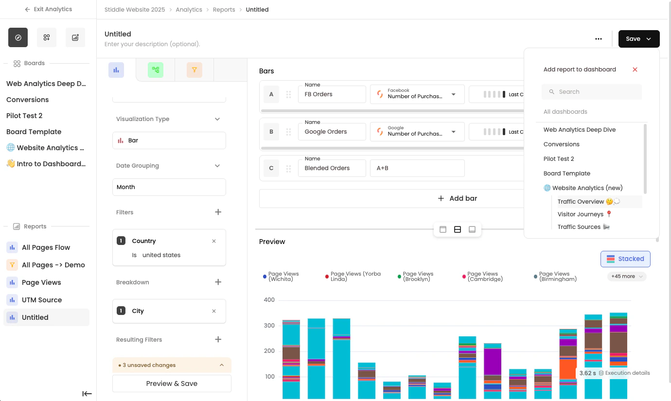
Funnel Reports
Funnels help you measure conversions and understand how customers move through key steps in your journey. Identify where people convert, where they drop off, and how different segments perform across each stage. Use Funnels to** answer questions like**: • What percentage of visitors completed a signup or purchase?• Where are customers dropping off in the funnel?
• How long does it take users to convert?
• How do conversion rates change across segments, channels, or time?
Creating a New Funnel Report
To create a new report, select New Report from the Create dropdown on the Analytics page, then select Create Blank Report in the popup.
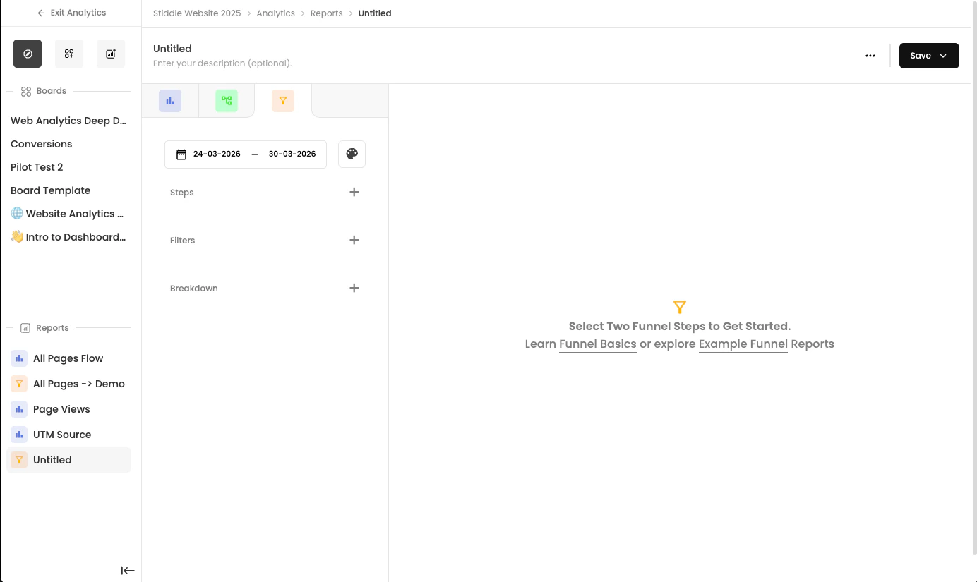

You need to select at least two steps for funnels to work, since funnels are designed to show you where people drop off and how they convert through your steps.
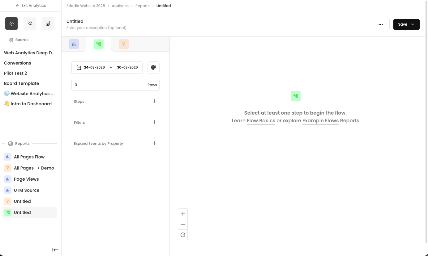
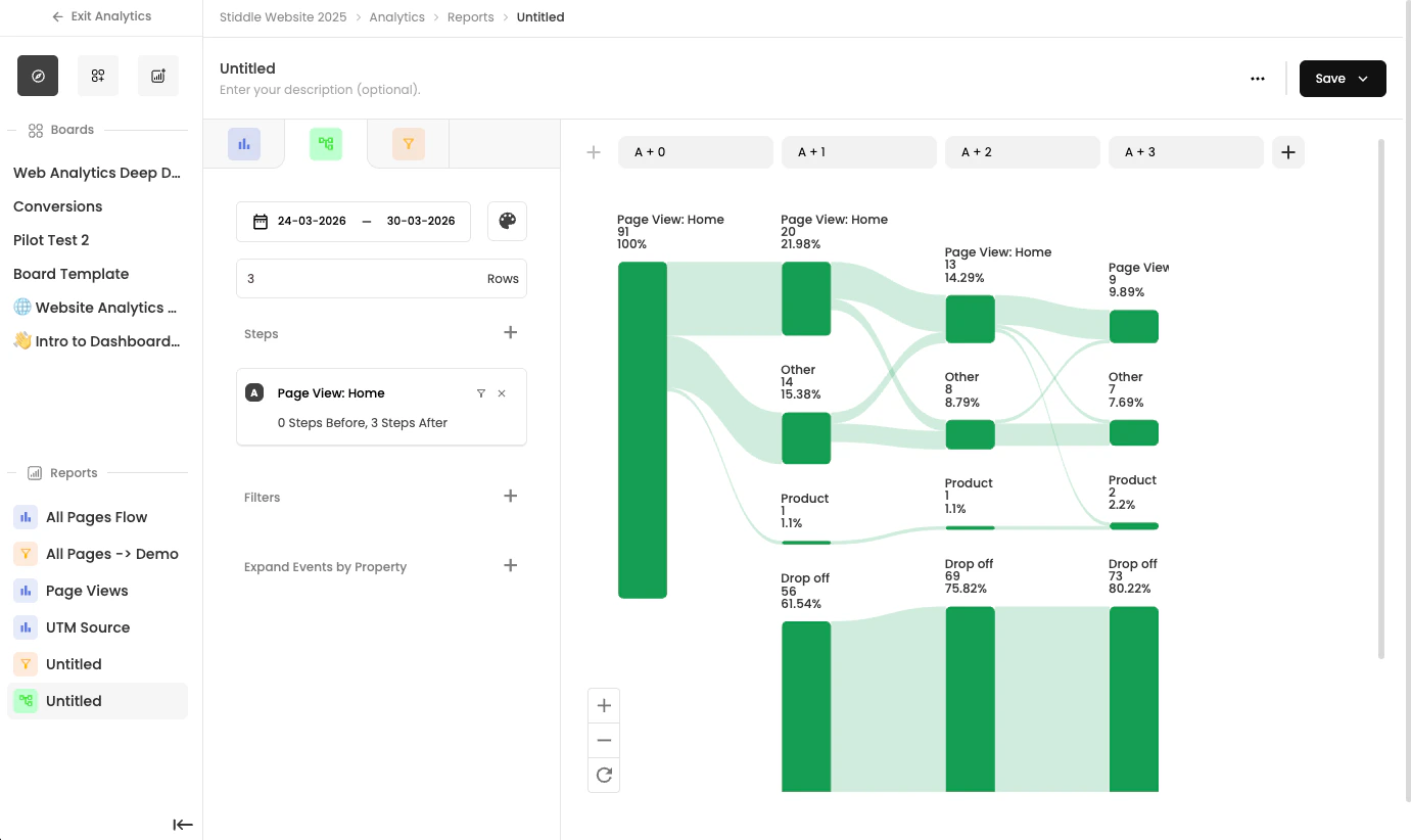
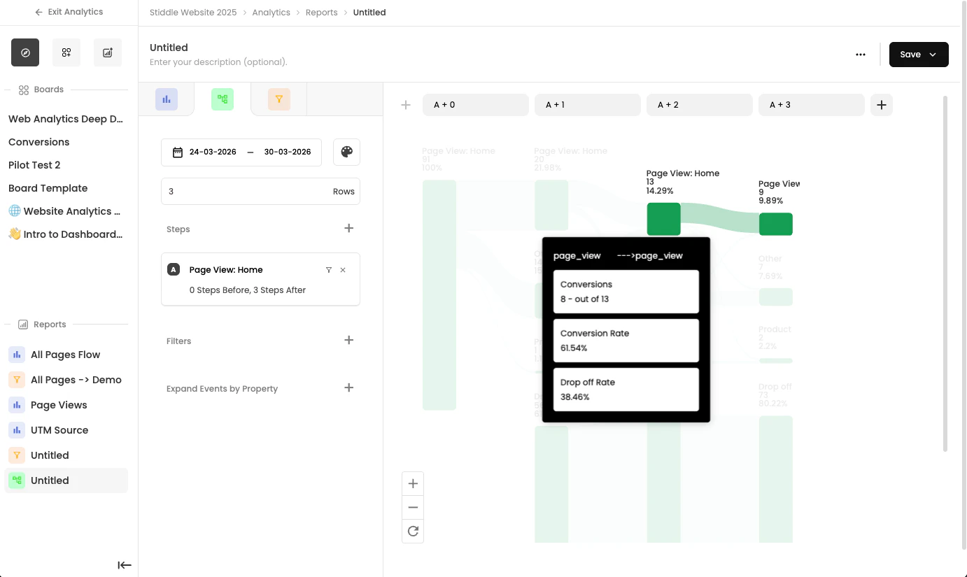
Flow Reports
Flows helps you visualize the paths customers take before and after key actions. When you’re not sure exactly how users move through your site or product, Flows maps the most common journeys so you can understand behavior patterns and uncover friction points. Use Flows to answer questions like: • What do users do immediately after clicking an ad?• What actions typically happen before a purchase?
• How do customers move from lead submission to conversion?
Creating a New Flow Report
To create a new report, select New Report from the Create dropdown on the Analytics page, then select Create Blank Report in the popup.